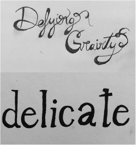
Sketching and design of lettering. The point of these designs was to draw a word and associate it with music that was played. The first one my word was gravity and the music was all in one motion unchanging so I did not lift off the page. The second one was more straight and to the point but still delicate hence the word I chose.